The seafloor relief (bathymetry)
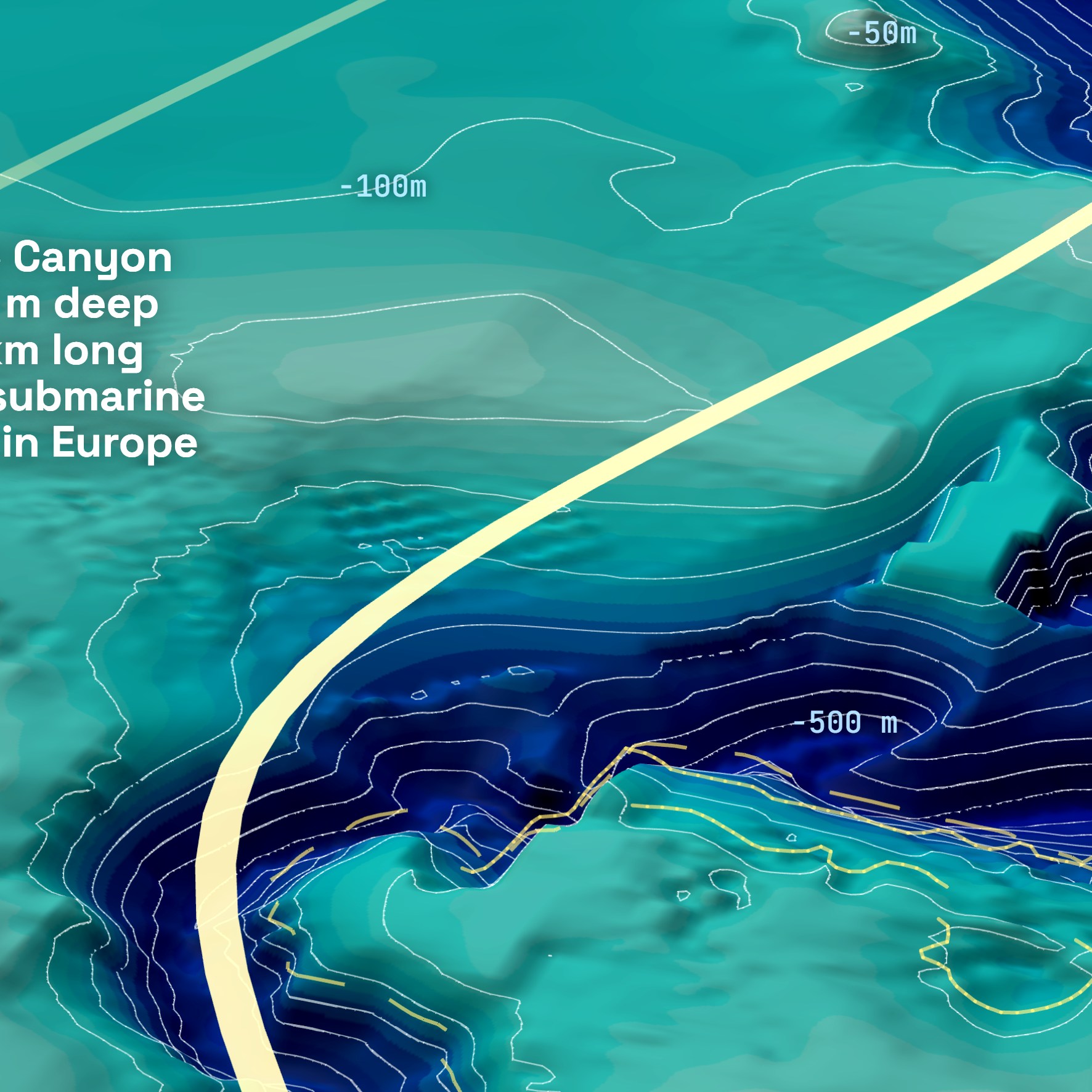
Every poster starts with bathymetric data — the measured depth of the seafloor, underwater, not an illustration. We pull it from open scientific datasets, mesh it into 3D terrain, and exaggerate the vertical scale so the relief that actually shapes the wave — a canyon, a reef ledge, a folded rock ramp — becomes readable at a glance. The color gradient encodes depth: darker blues sit deeper, the palette lightens toward the surface. This is different from the land's own terrain relief (mountains, valleys) — see "The map itself" below. Bathymetry is the single most important layer on the poster — it's the physical cause everything else explains.
Swell arrows and wave crests
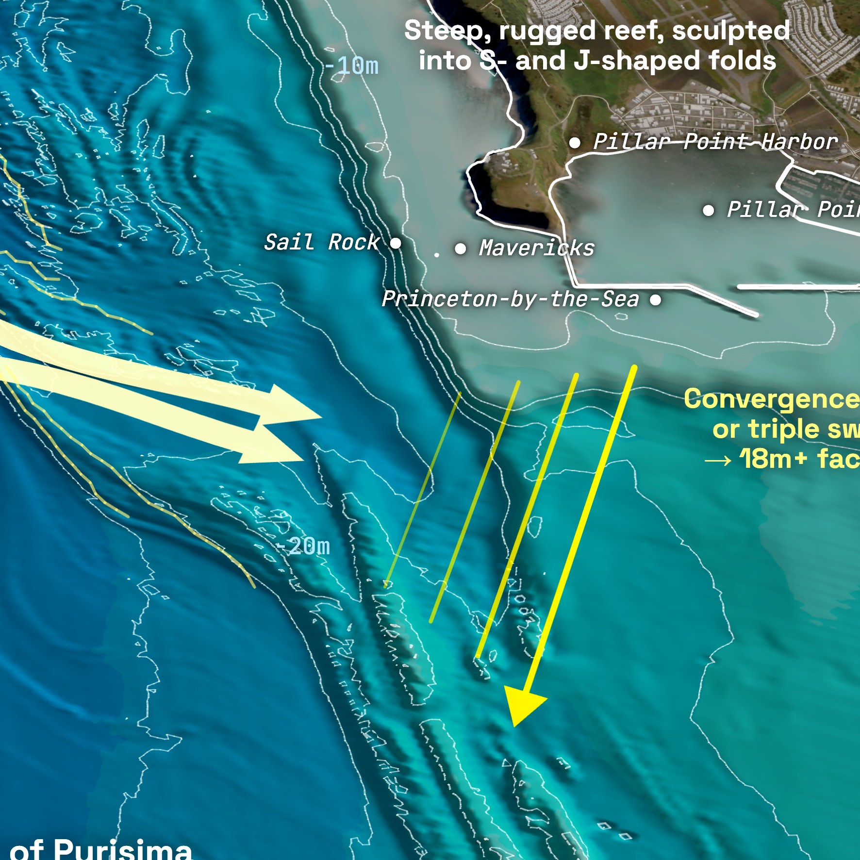
The light yellow arrows and yellow hash marks are the one part of the poster that's illustrative rather than measured. They represent the physical mechanism — which direction the swell arrives from, where it converges or bends, where the wave actually breaks — as described in the scientific and surf literature for that spot. This is the second essential layer: together with the relief above, it's what actually answers "why does this wave form here?" That's why the legend labels it explicitly as "illustrative swell and waves" — a schematic explanation of the mechanism, not a physics simulation.
The map itself
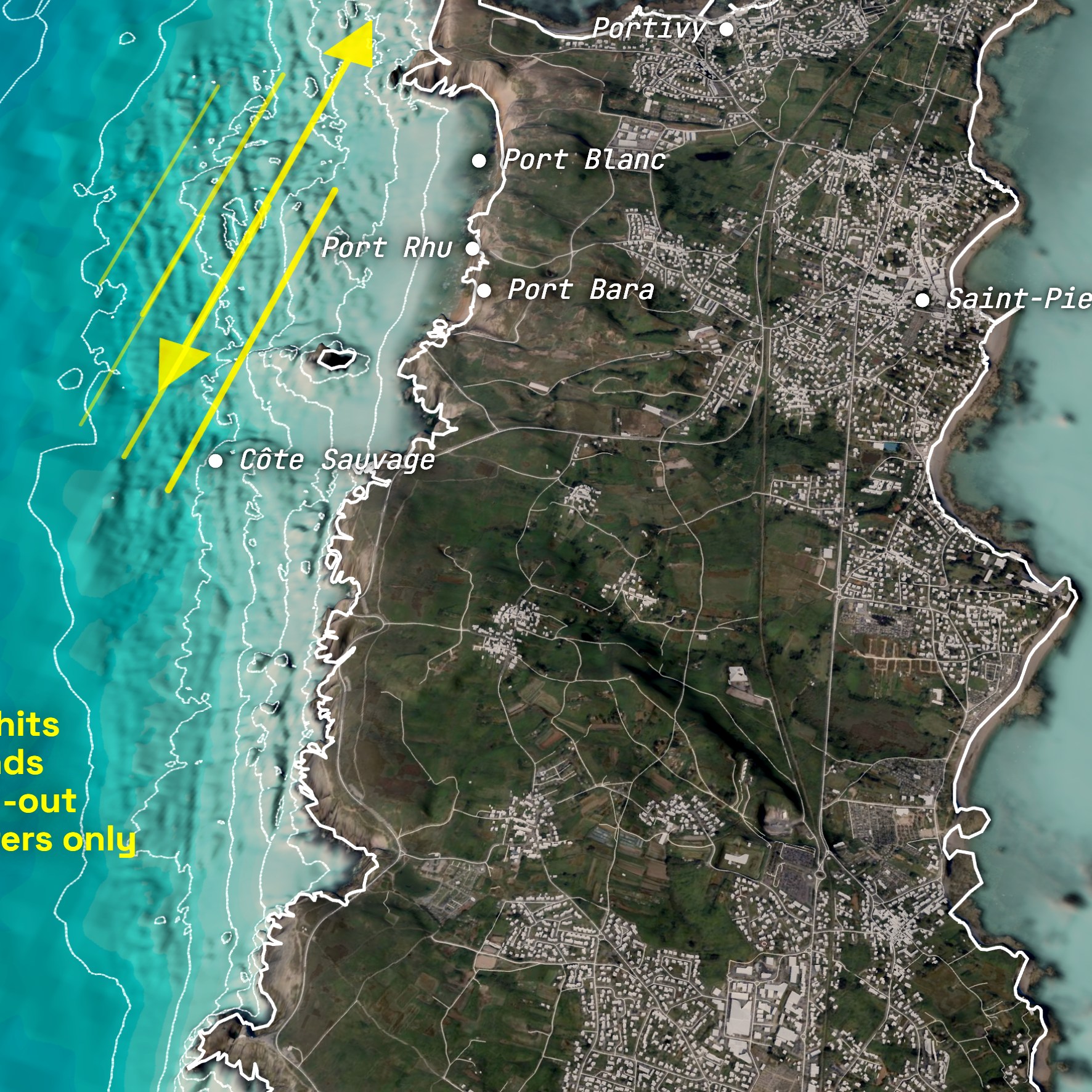
Everything you see that isn't the underwater relief or the swell is sourced map data too, not drawn by hand: the coastline tracing every headland and inlet, roads, building footprints, and the place names that give the spot context — all pulled from open map data. The land itself has its own elevation data (mountains, valleys, cliffs), from a separate open terrain dataset — relief too, but unlike the seafloor's, it isn't what explains the wave. Land is rendered from open satellite imagery. What you're looking at is the actual shape and layout of the place, not a stylized approximation of it.
The annotations
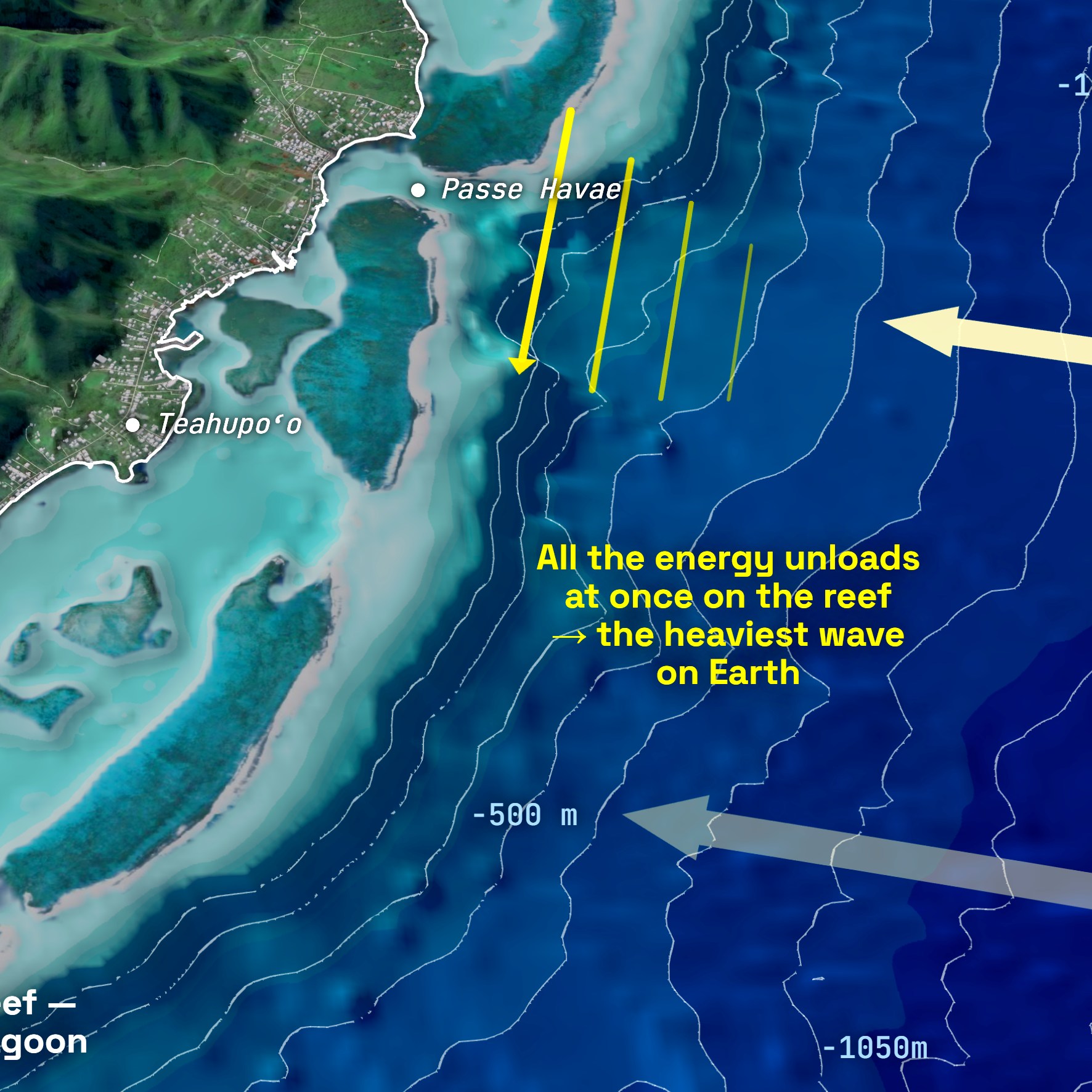
Every callout answers one question: why does this wave behave the way it does? Each label is researched for that specific spot — the mechanism, the record waves, the local names — and checked against more than one source before it earns a place on the print. Where sources disagreed, we went with the better-supported account rather than picking whichever sounded most dramatic.
The conditions box
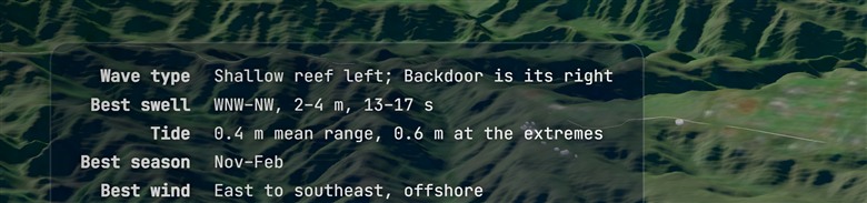
Top-left, every poster carries a quick-reference panel for the spot itself: the wave type, the swell that lights it up (direction, typical size and period), the tide, the best season and the best wind. It's the practical companion to the physics on the rest of the print — the same spot summed up the way a surfer sizes it up before paddling out. Each line is researched per spot and cross-checked, like the annotations.
The legend
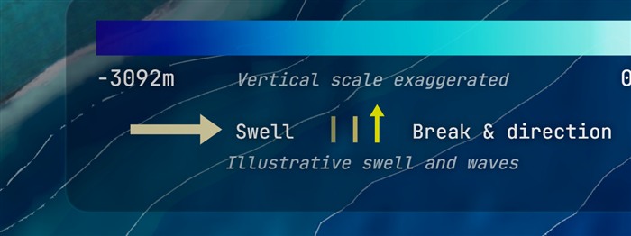
Every poster carries the same legend, bottom-left: the depth scale (with a reminder that the vertical relief is exaggerated — ×2, sometimes ×3 — for readability), and what the swell arrows and wave hash marks mean — explicitly flagged as illustrative, not measured.
Credits & wave mechanism

Bottom-right, every poster credits its own data and its wave-mechanism references. Nothing on the poster is uncredited.
Under the hood
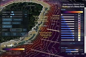
Each poster comes out of an in-house 3D engine that runs entirely in a web browser. A geospatial data-preparation and interactive-rendering pipeline turns open data into a single model of the coast you can pan, zoom, rotate and fine-tune in real time. A compass rose and a scale bar track the view live — the rose reorients to true north and tilts with the camera, and the scale always reads the real ground distance.
For the prints, that live scene is re-rendered off-screen at print resolution — sharp enough for a large-format poster. Same engine, same data, turned from an interactive view into a poster-quality image.